YCC : MOBILE APP FOR PARENTS
Context
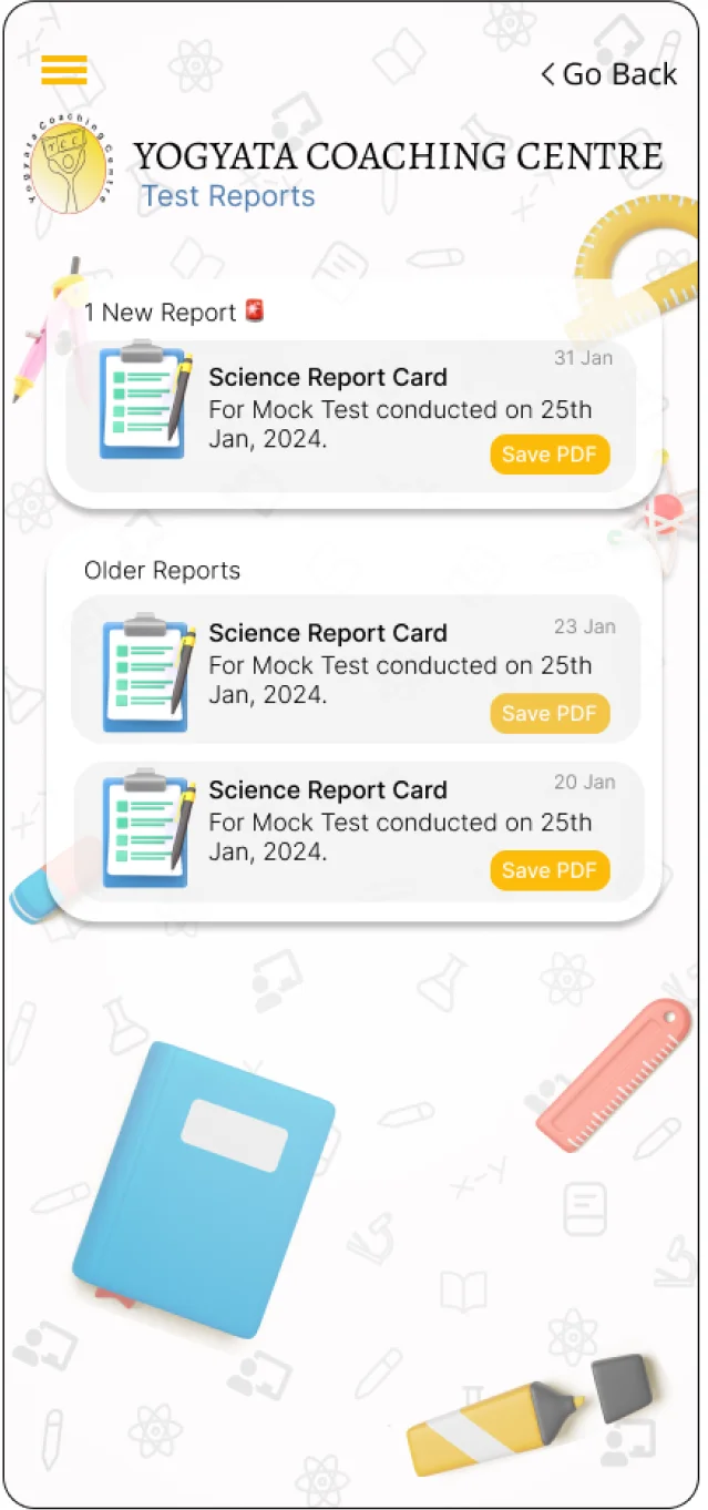
To create a friendly and visually pleasing User Interface for a coaching center’s mobile application. The aim of the app was for parents to receive notifications and test reports of their children.
Brand Colors
Yellow and Red
Time Frame
5 days (7 Jan 2022 to 11 Jan 2022)
Role
UI Designer, Usability Researcher
Involvement
Mobile Interface Design, Usability Testing
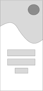
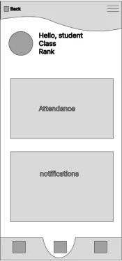
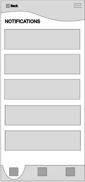
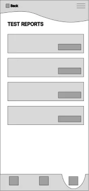
WIREFRAMES PROVIDED TO ME
INITIAL MOCKUPS


USABILITY TEST INSIGHTS
Upon conducting a usability test on 5 users across different age groups raging from 14 to 50 years old, the following changes were made:
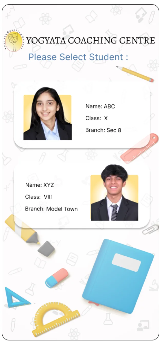
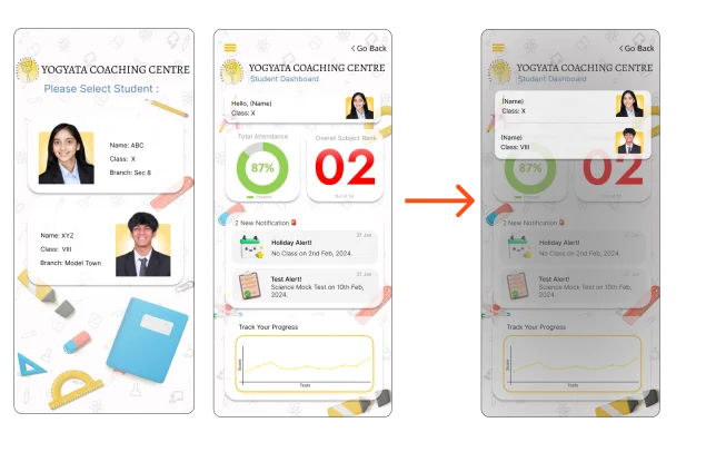
1. PROBLEM:
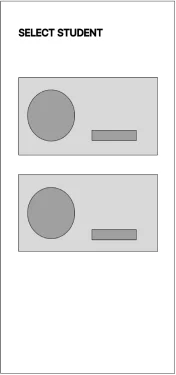
For parents who have more than one students enrolled, selection of the student beforehand, creates more steps and may be overall confusing
SOLUTION:
Select Student dropdown option at the dashboard
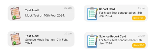
2. PROBLEM:
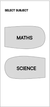
Having separate layouts for each subject may be very confusing to track and the user may miss out on information
SOLUTION:
Select Student dropdown option at the dashboard
3. PROBLEM:
Yellow Buttons with white text are not very readable
SOLUTION:
Select Student dropdown option at the dashboard

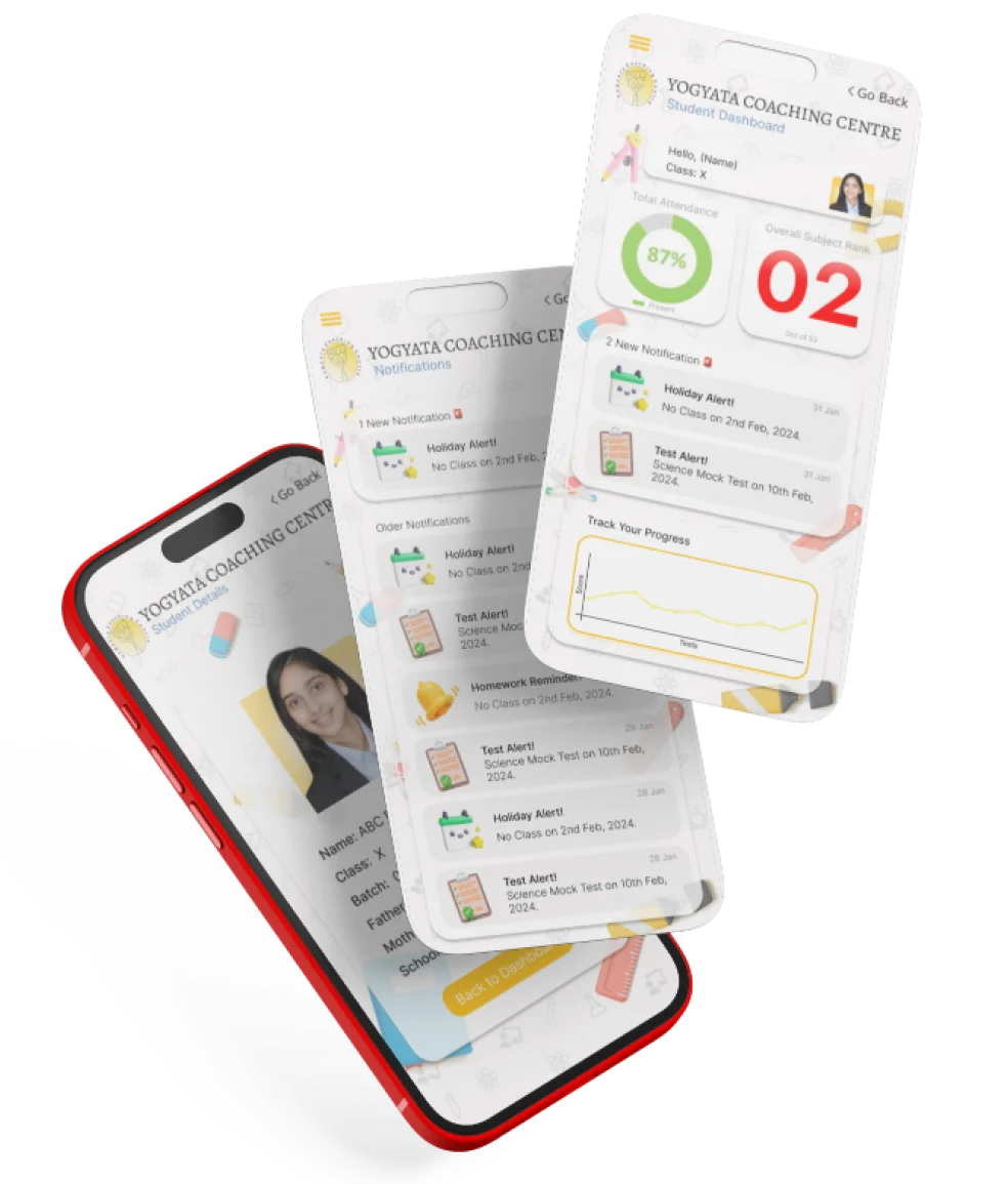
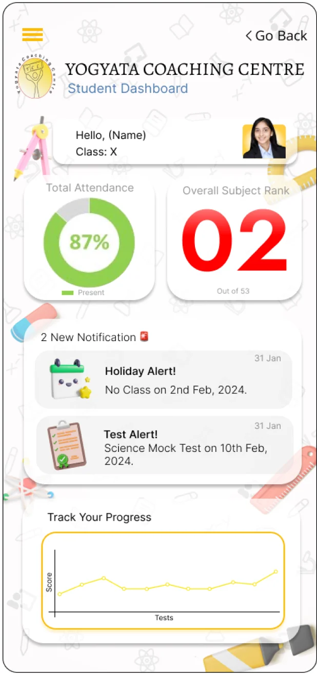
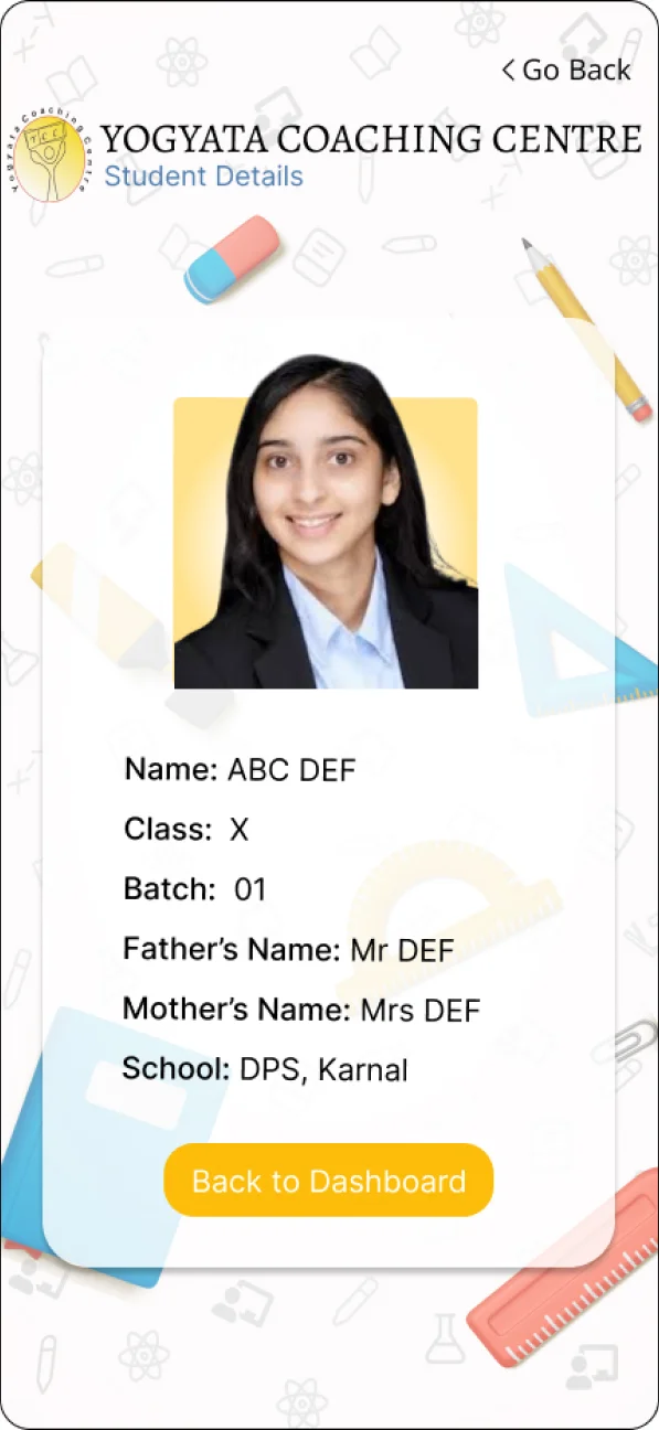
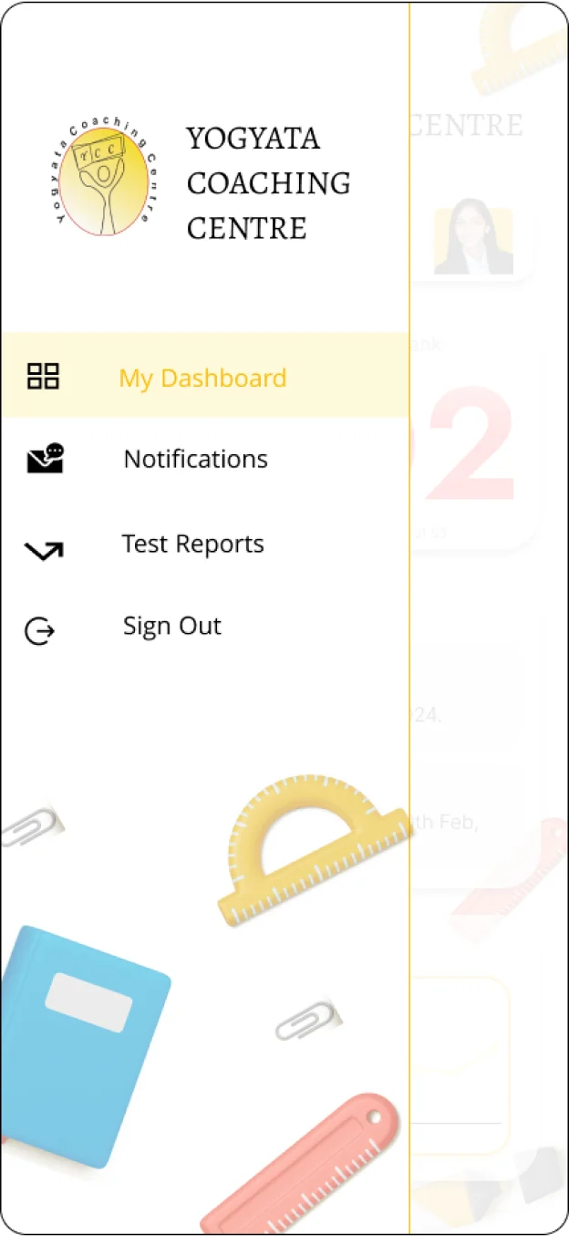
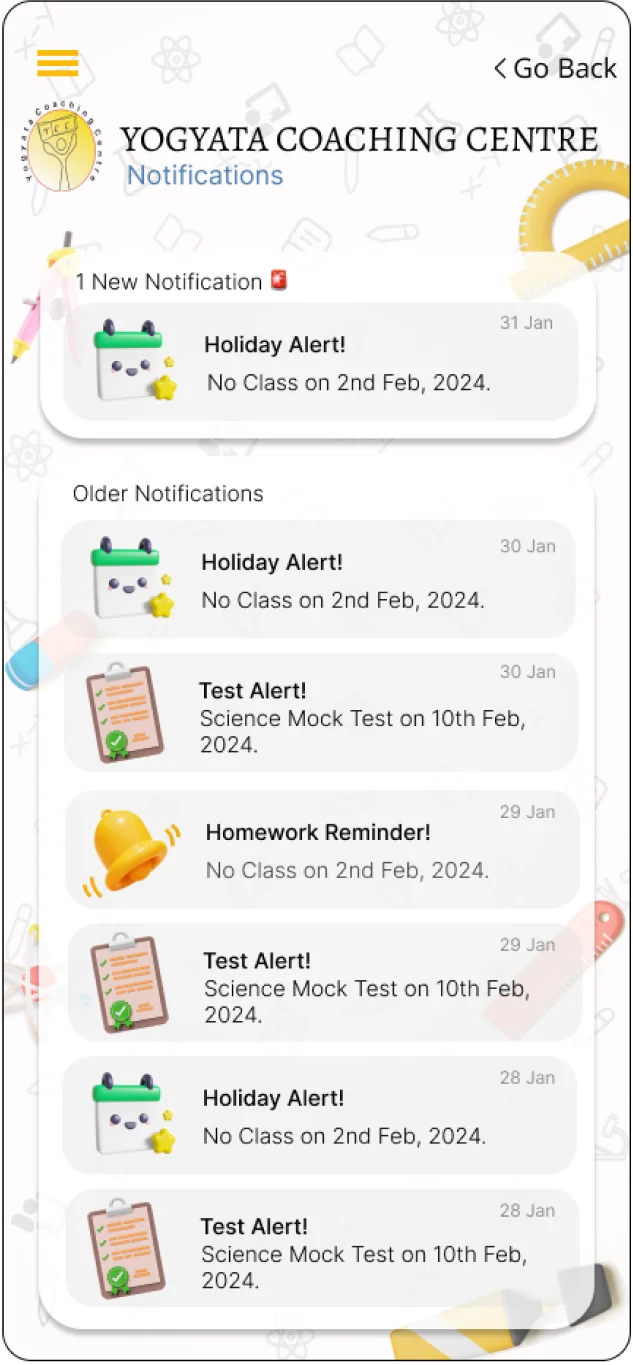
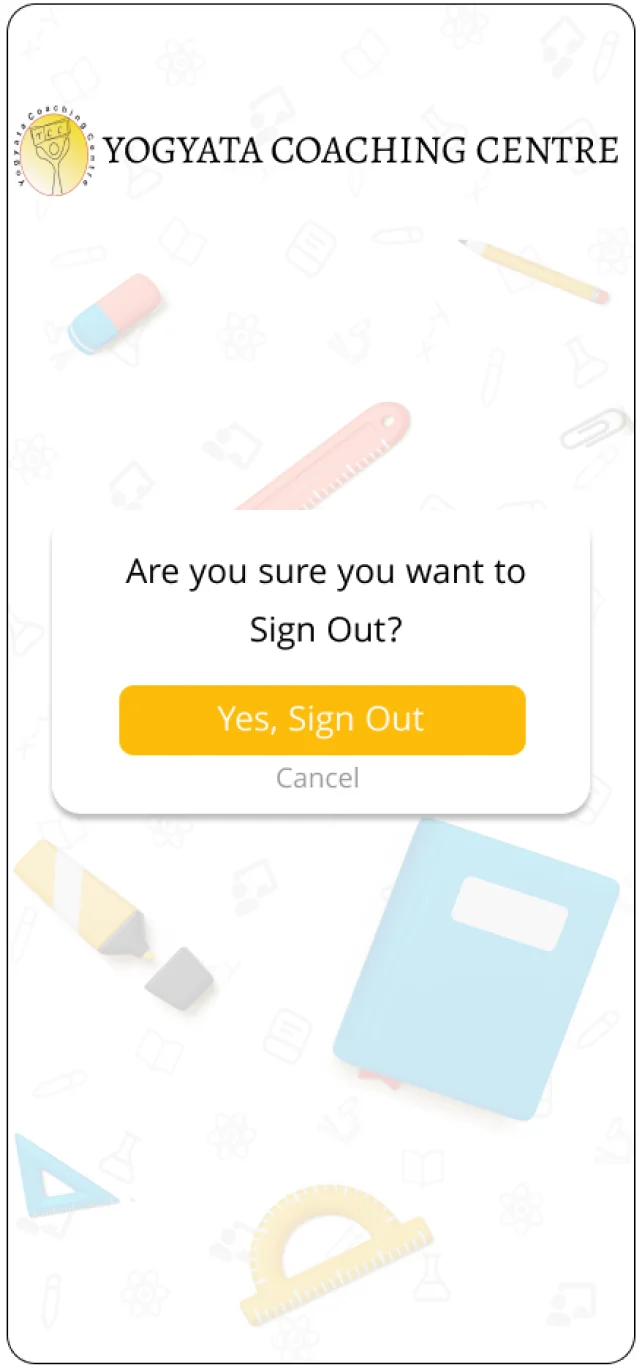
FINAL DESIGNS
VISUAL SYSTEM
REFLECTIONS
This was my first project where I worked with a large team and it was a fun collaborative project. My focus for this project was User Interface Design and initially, I wanted to make everything really fancy and add a lots of animations and transitions, but the more I got to explore the workings of design, I started to value more plain and simplistic designs that are centered around the user. I also got to interact with the Development Team and discuss plausible features that aligned with the time and budget of the project.